Visual identity · Freelance · 2026
Sollar: building and sun in a single symbol
A new identity for a property management company in Recife, drawn from sunlight falling on the city’s buildings.
The brief
The brand needed to convey security, trust, consistency and closeness, while keeping a warm, contemporary feel.
The challenge was balancing the solidity expected of a property manager with the human care of its relationship with residents.
Concept
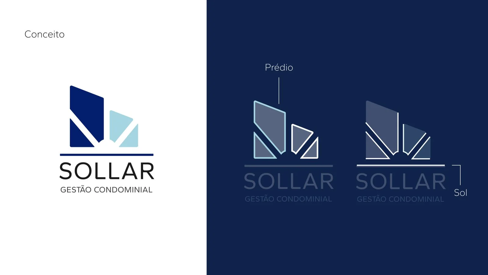
The sun lighting up the inside of a home: a metaphor for the clarity, warmth and well-being the company wants to offer.
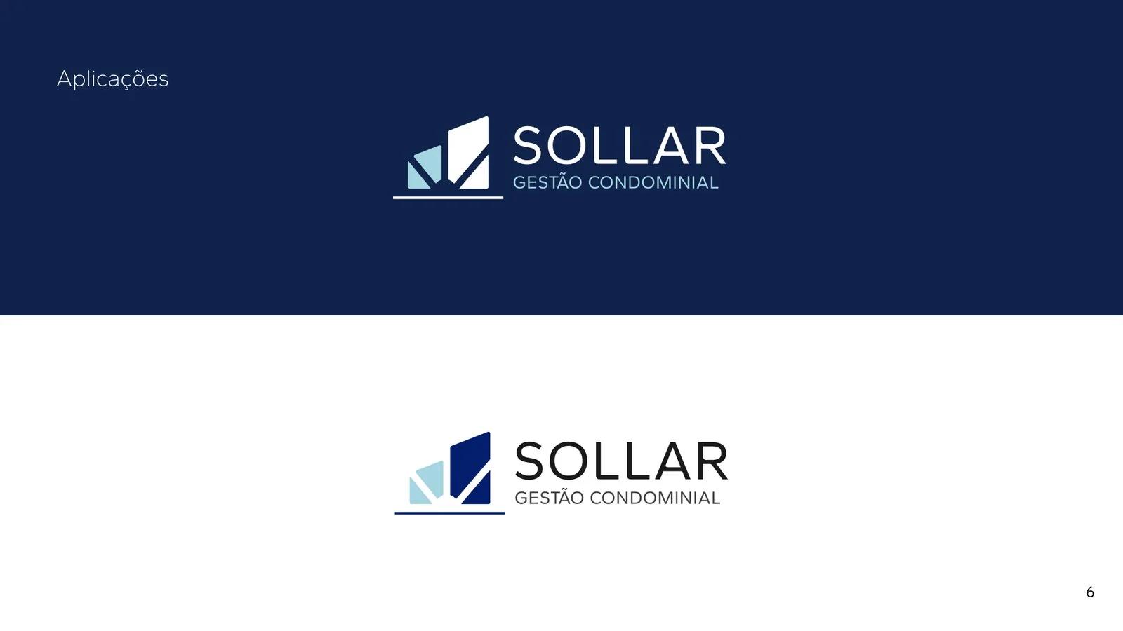
The explorations drew on biomimicry and the observation of natural phenomena. The way sunlight hits Recife’s buildings gave rise to the symbol’s shapes, which read as both a building and a sun.
Typography and color
The lettering got subtle tweaks at the terminals, combining organic shapes with a controlled geometric structure.
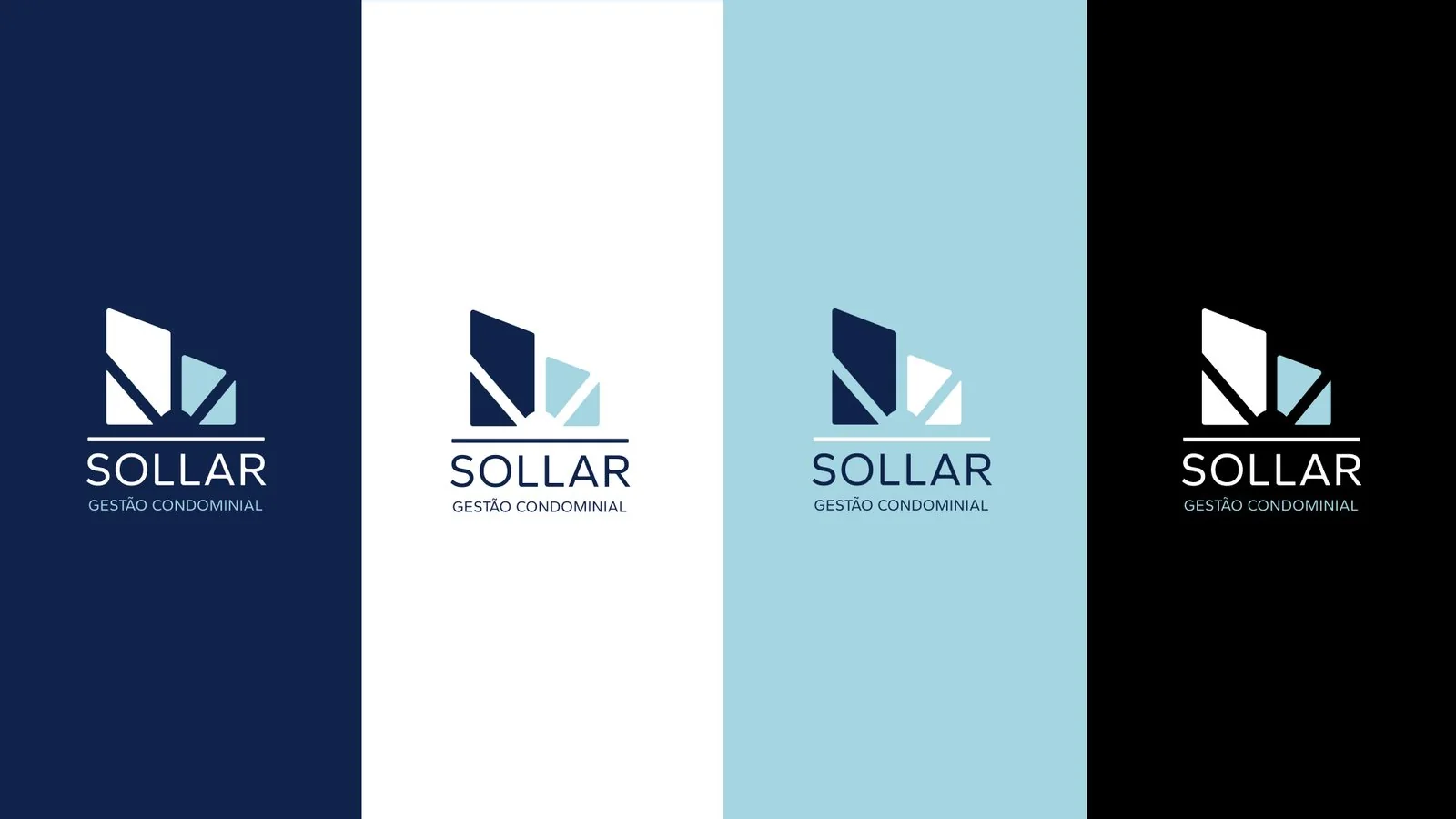
The result balances modernity, naturalness and precision. The palette of deep and light blues reinforces security, trust and closeness.
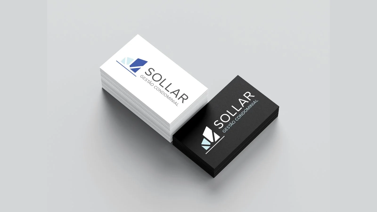
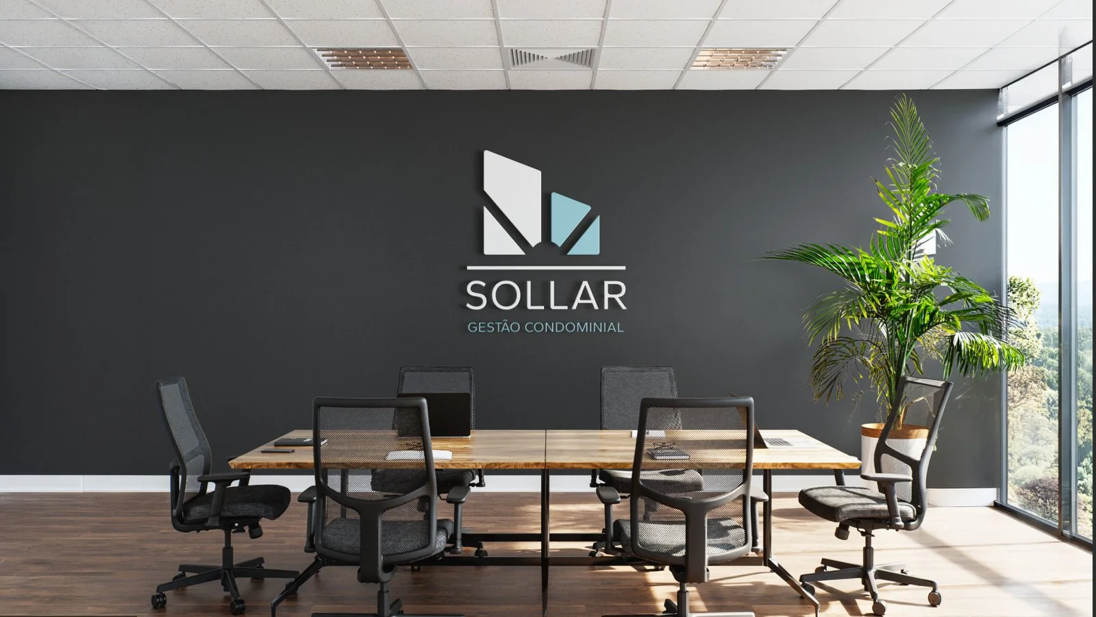
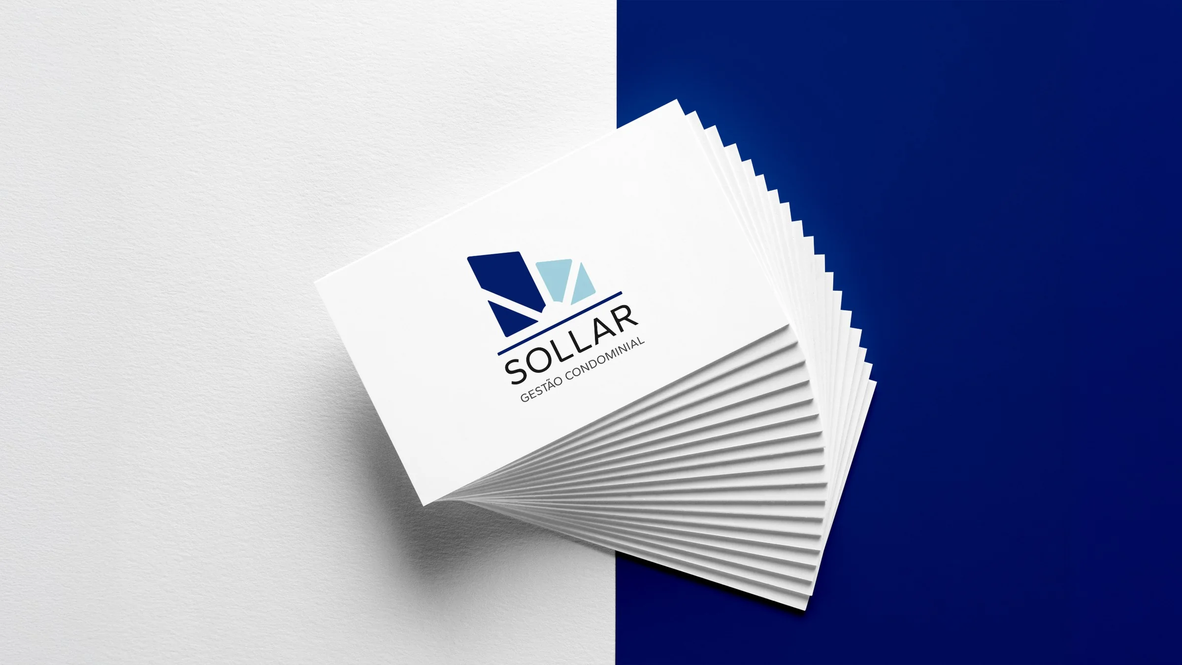
Applications
The result translates into shape, color and type the balance between the solidity of property management and care for people.